

Revolut · UX Redesign · Feature Discovery · 2026
Revolut has one of the most complete financial products in Europe. After talking to 16 users across 4 countries, I found out most of them had no idea.

Role: UX Researcher and Designer
Type: Fintech · Mobile UX
Tools: Figma · User Interviews
Year: 2026
The problem
The problem is not what the product offers. It is what the product communicates. Users open Revolut, use it for one thing, and close it without ever discovering what else it can do for them. This redesign starts with that gap.
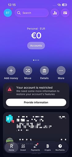
In the current interface, 50% of the screen is occupied by the account balance. Below it, four generic buttons: Add money, Move, Details, More. The word "Move" gives no indication of what moves, or where. "More" is where features go to be forgotten. The remaining depth of the product sits behind four pagination dots that most users never notice, with no visual hint that anything exists beyond them.

-
"Move" communicates nothing. Move what, and where?
-
"More" buries every meaningful feature behind a single tap and a long list
-
Four invisible pagination dots with no peek of the next screen users do not know they exist
User research
Before designing anything, I needed to understand what real users actually knew about the product they were already using.
I reached out to 16 Revolut users across four countries: Brazil, Italy, Mexico and Ireland. With nine questions focused on daily usage patterns and feature awareness. The conversations were intentionally casual. No UX jargon, no leading questions. I wanted to hear what people genuinely knew, not what they thought I wanted them to say.
The pattern was consistent across all 16 participants regardless of nationality or usage frequency.

-
Every participant used Revolut primarily to send and receive money
-
Only 3 out of 16 knew about paid subscription plans — one saw an advertisement, two discovered it by exploring the app on their own
-
Nobody discovered the Vaults feature through the app itself
-
Only one participant had ever bought crypto through Revolut, and described it as an impulse decision
One participant from Ireland said they had no idea Revolut offered anything beyond basic payments. Another from Brazil only discovered Vaults because their partner started using it for rent savings.
This is not a user awareness problem. It is an interface architecture problem.
Benchmark
Nubank and PicPay solved this exact problem through visual hierarchy — features surfaced as labelled icons, organised by how users think about their money, not by how the company structures its product internally. The logic was sound. The question was whether it translated to Revolut's product depth and European context.
Revolut has a deeper product than both. It communicates less.
Design process
The redesign started with structure, not colour. Every decision in the wireframe phase had to answer one question: does this help the user understand what the product can do for them? Colour, typography and visual polish came after that question was answered.
The redesign started with structure, not colour. Every decision in the wireframe phase had to answer one question: does this help the user understand what the product can do for them?


The redesign
Three decisions define this redesign, and each one comes directly from the research.
The account balance stays at the top. That is what users come for. Immediately below it, a card showing the current subscription plan with a one-tap upgrade option. This is not a promotional element. It is information the user is entitled to see about their own account, surfaced where they will actually notice it.
Below the balance card, a Daily Life section replaces the four generic buttons with five labelled icons: Transfer, Payments, Phone Recharge, Crypto, and Invest. Each icon is named. Each one is visible without scrolling. The first icon in the row reflects the user's most frequent action. It is larger and more prominent than the others, because familiarity should feel personal, not generic.
At the bottom of the home screen, two rows give users instant access to their Account Details and Card Details with a single copy action. This addresses the most common real-world use case from the research. Receiving money requires sharing account information, and that process currently involves navigating away from the home screen entirely.
Before / After

How I'd measure success
Since this is a concept project, I defined success metrics before designing. Hypotheses first, solutions second.
Primary: Increase in feature activation rate within the first 30 days of use If the interface communicates what the product offers, more users should interact with Vaults, crypto and investment features early in their usage cycle.
Primary: Increase in conversion from Standard to paid subscription plans The current interface does not tell most users that paid plans exist. Surfacing the plan status and upgrade option on the home screen directly addresses this gap.
Secondary: Reduction in time to complete a money transfer The redesign keeps the transfer action on the surface. This should reduce the number of taps required to complete the most common user action.
Guardrail: No reduction in transfer completion rate The feature that already works should not be disrupted. If the redesign increases friction on the core use case, it has failed regardless of everything else.
What I'd do differently...
My research captured regular users. People who open Revolut a few times a week for payments and transfers. These are not the users who would benefit most from the redesign. The users most likely to activate Vaults, invest in crypto or upgrade their plan are those who are already curious about the product but have never found a reason to explore it. Their mental models and motivations are likely different from what my research captured, and the interface should be tested specifically with them before any launch decision.
I would also test whether the personalised icon, the one that reflects the user's most frequent action, creates clarity or confusion in the first few sessions, before usage patterns have had time to establish themselves. The logic is sound. The assumption needs validation.