

UX Redesign · Reis Revisional · 2022–2024
A company with 2,800 verified reviews and ISO certification that looked like it didn't deserve them. A UX redesign to close that gap.
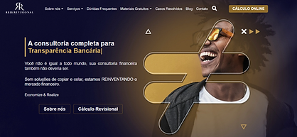
Role: UX Designer, Information Architecture Type: Financial Services · UX Redesign Concept Tools: Figma, Competitive Benchmarking
Year: 2024

The problem
Reis Revisional is a financial consultancy operating since 2013, with ISO 9001 certification and over 2,800 verified Google reviews. They have helped more than 10,000 families reduce abusive banking debt. The credentials were exceptional. The website did not reflect them.
When a user is considering trusting a company with a debt negotiation worth tens of thousands of reais, the visual language of that company's website functions as a trust signal — or a red flag. The existing site looked inconsistent with the level of professionalism the company had earned.

-
Navigation listed 7+ services with no grouping — users couldn't quickly identify which service matched their situation
-
No emotional framing — the site led with company history, not user problems
-
Visual language dated and inconsistent — did not match the trust level of established financial institutions users were familiar with
Research approach
The goal was not to make Reis Revisional look like a bank / startup / fintech. The goal was to make it look like a company users already trust with their money — major Brazilian banks and established financial institutions. I conducted a visual and UX benchmark of Banco do Brasil, Itaú and Caixa Econômica Federal to identify the design conventions that communicate institutional reliability: colour systems, typography weight, navigation structure, and the balance between authority and accessibility.


Redesigning the navigation
The original navigation listed seven services as flat items. Users arriving with a debt problem had to read every item to find their situation. I restructured the menu into two clear categories "Redução de Juros Abusivos" and "Análise e Revisão" each with icons and short descriptions. The logic follows how users think about their problem, not how the company organises its internal services.

Before

After
Emotional framing as a UX decision
Users arriving at a debt consultancy are already under financial stress. The original site led with company credentials — ISO certification, years of operation, awards. The redesign leads with the user's problem: "O que acontece se eu não pagar o financiamento de um carro?" (What happens if I do not pay my car?)
This shift — from "what we are" to "what you're facing" — reduces the cognitive distance between the user's situation and the service being offered. Each card addresses a specific debt type, allowing users to self-identify immediately rather than reading through service descriptions.


Each card addresses a specific debt type — users self-identify their situation without reading service descriptions.
The redesign

How I'd measure success
Hypotheses before solutions. These are the metrics I would instrument from day one, defined before any design decision was made.
Primary
Reduction in time-to-click on the correct service from the homepage
Baseline: measured via session recording on current site. Target: ≥30% reduction with grouped navigation.
Primary
Increase in CTA conversion rate on the homepage hero
Shifting from company-first to problem-first framing should reduce cognitive distance and increase intent to contact. Target: ≥15% uplift.
Secondary
Reduction in bounce rate on the homepage
Users who can't identify their situation in the first scroll leave immediately. Improved navigation and emotional framing should reduce early exits.
Guardrail
No increase in anxiety signals from usability testing
The problem-first framing ("what happens if I don't pay?") may increase stress at a vulnerable moment. This hypothesis requires validation before launch.
What I'd do differently...
This project was never published. The next step would be validating the emotional framing with real users — specifically people with active debt considering a consultancy. Leading with 'what happens if you don't pay' may increase anxiety rather than motivation at the decision point. That hypothesis needed usability testing before launch.
I would also instrument the navigation redesign — tracking whether the grouped dropdown reduced time-to-click on the relevant service, compared to the original flat list.